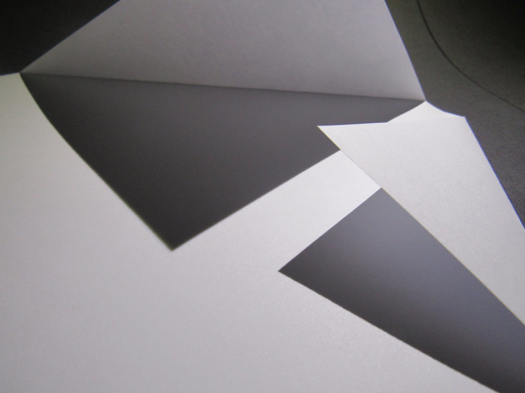
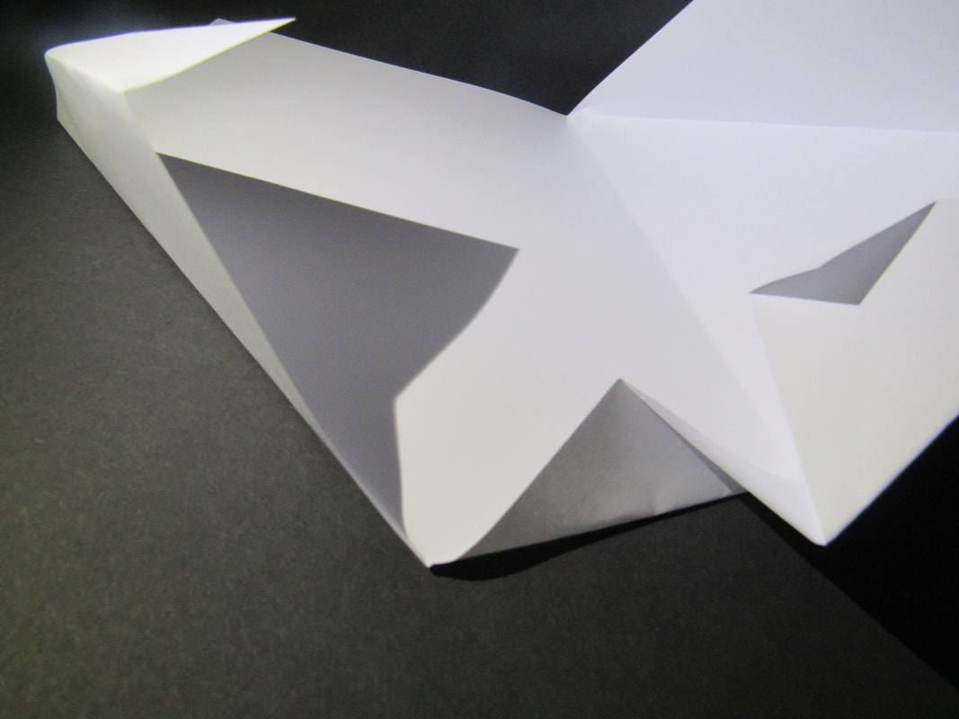
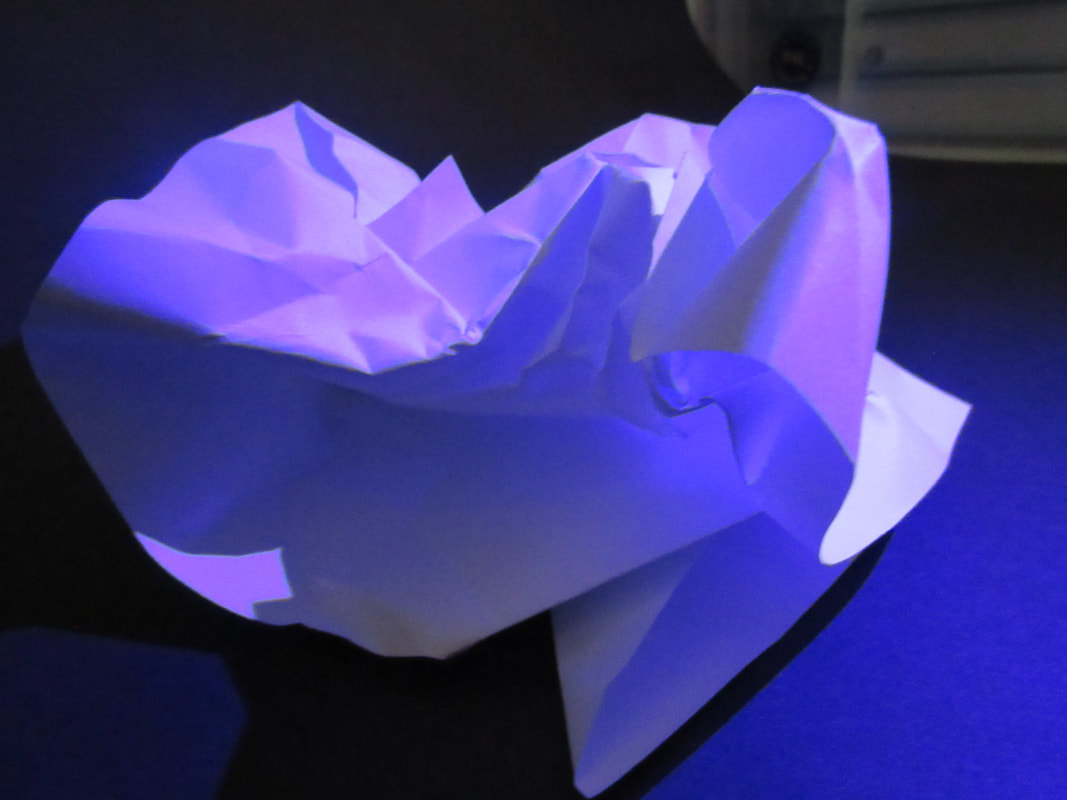
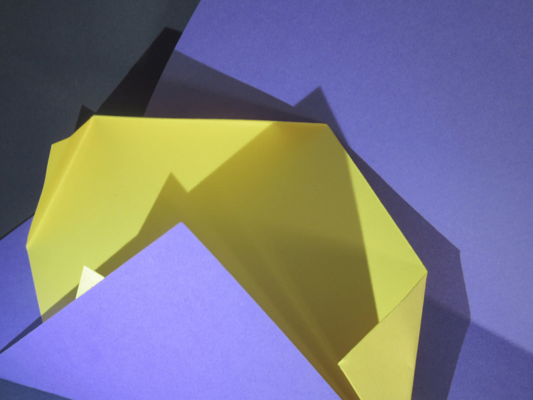
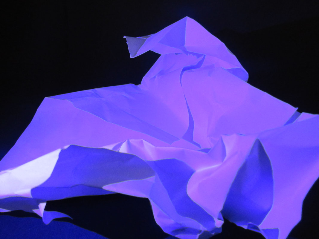
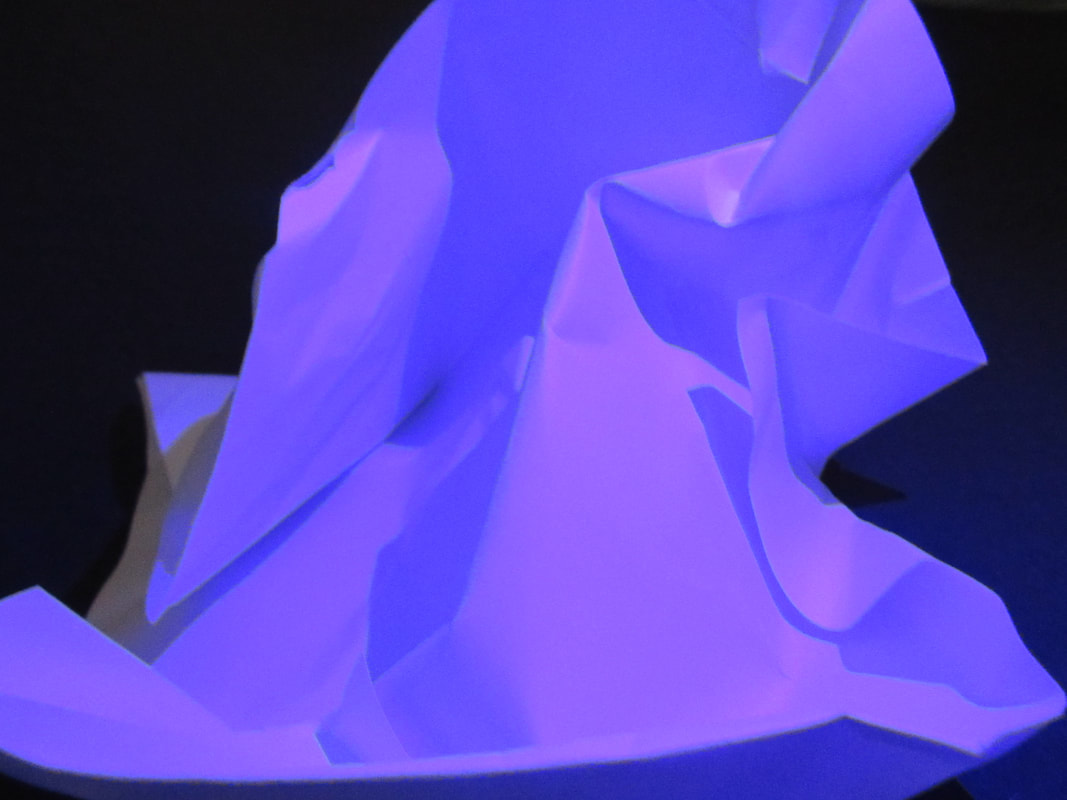
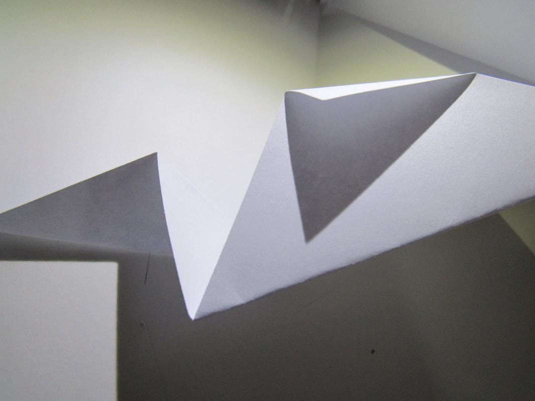
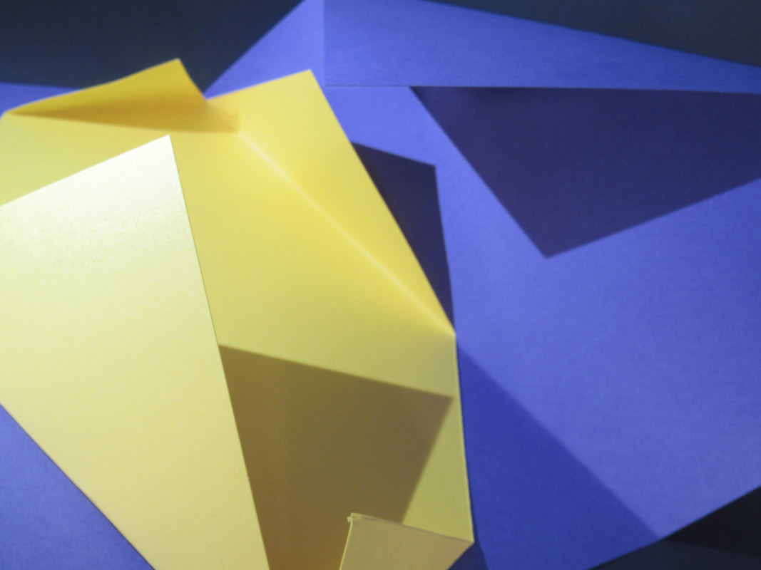
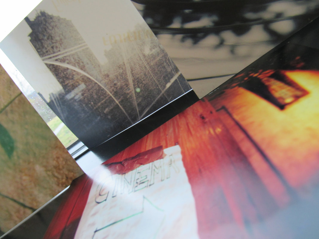
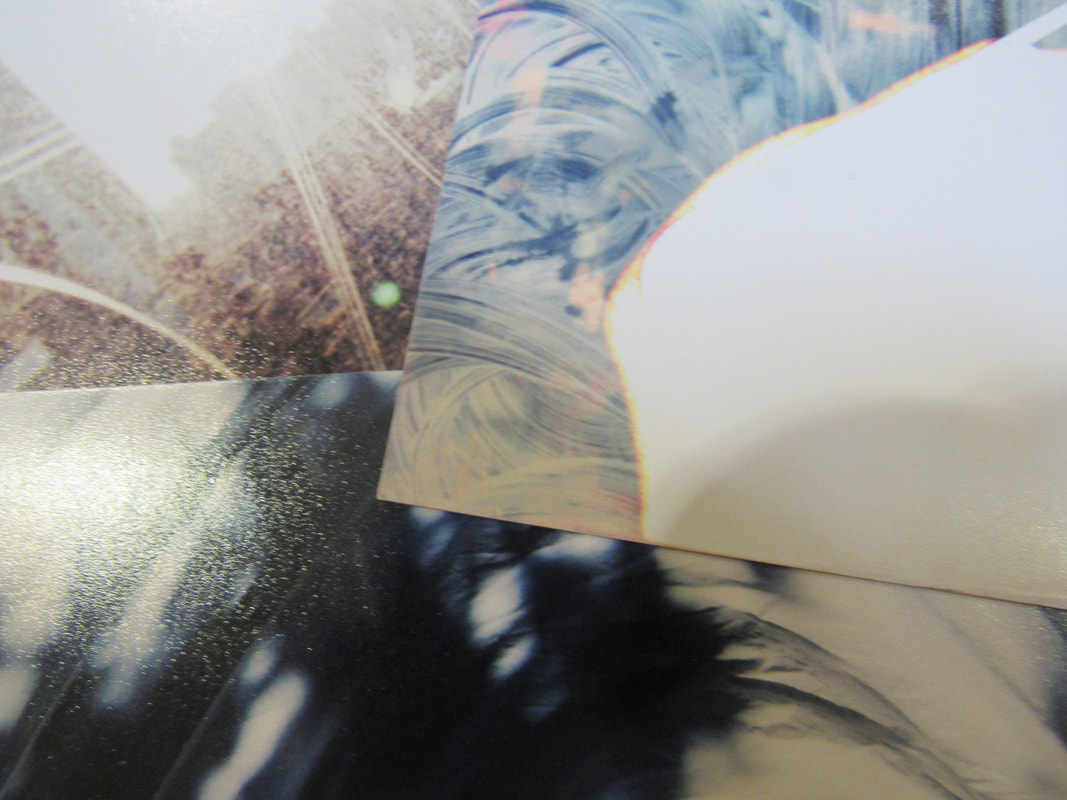
These are different coloured sheets of folded paper taken into different lighting.
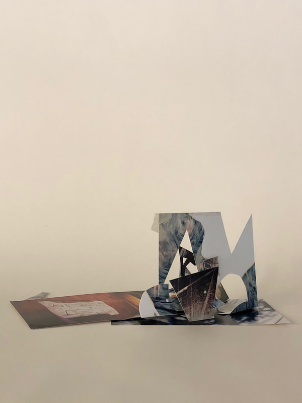
Using Photoshop.
edges assessment!
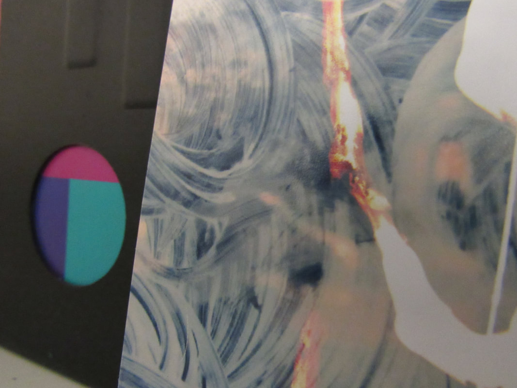
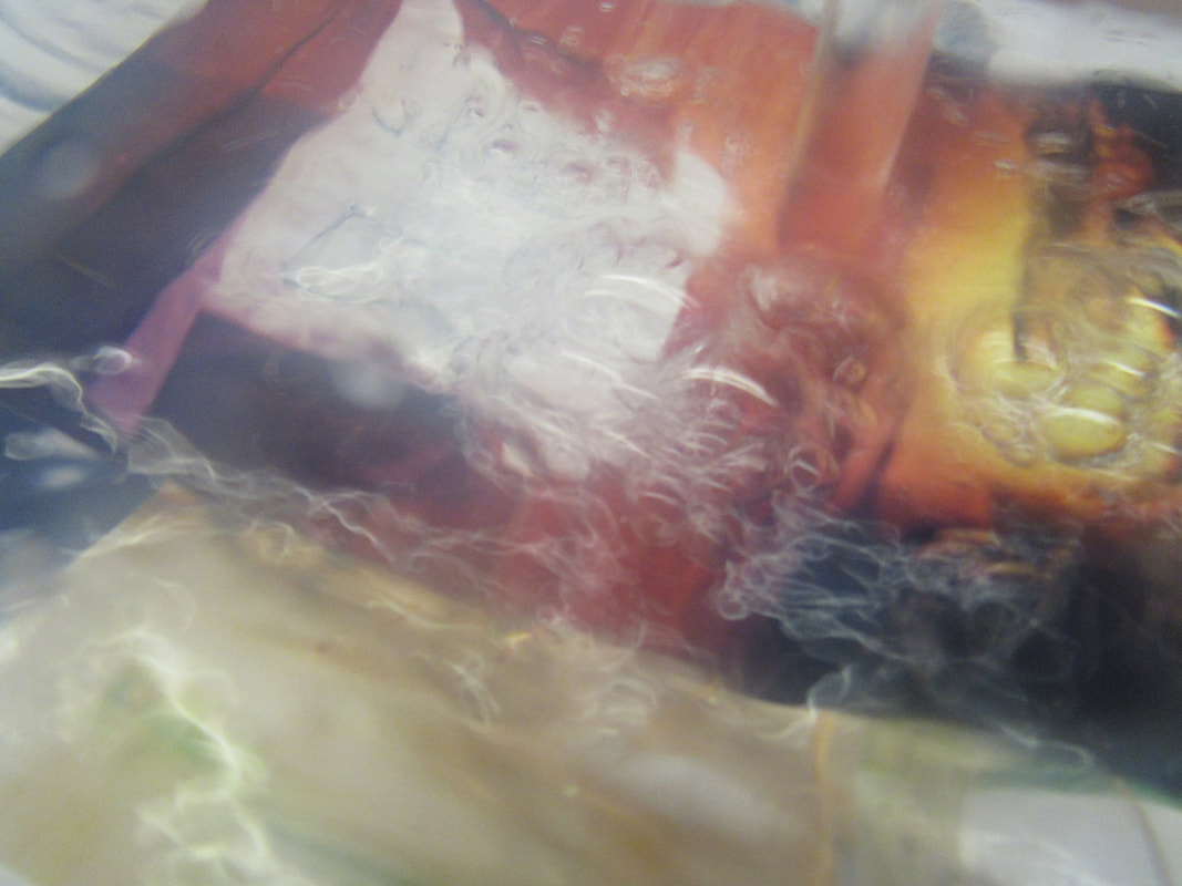
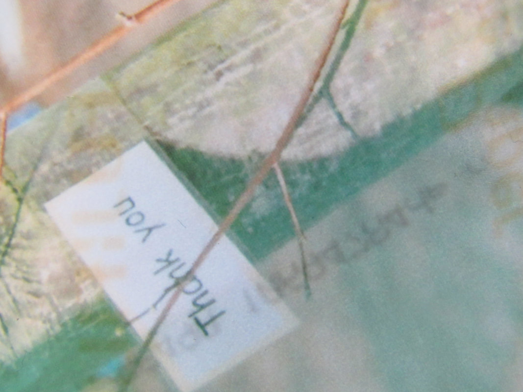
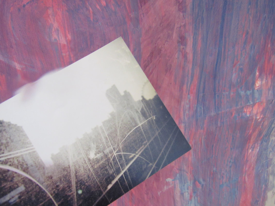
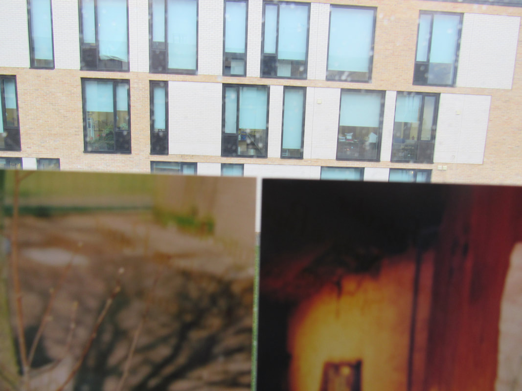
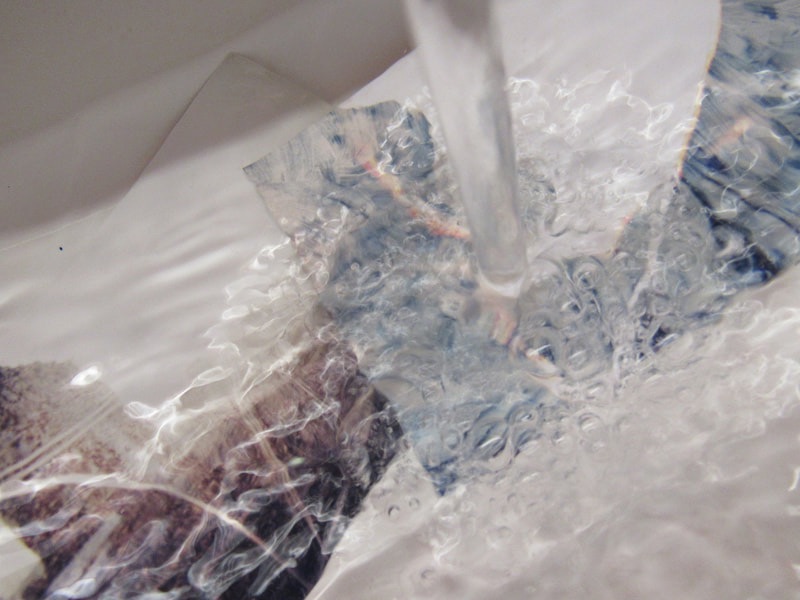
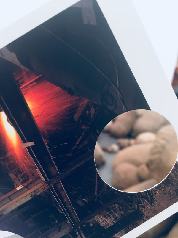
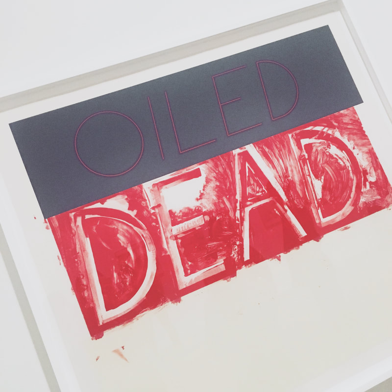
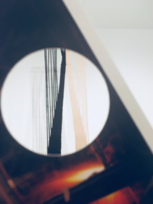
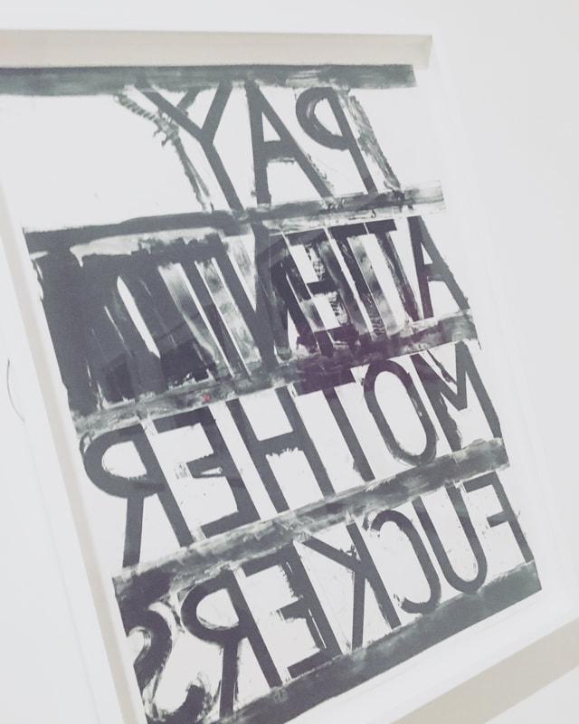
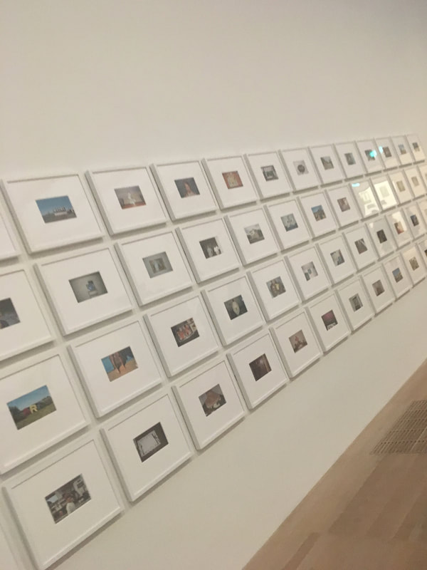
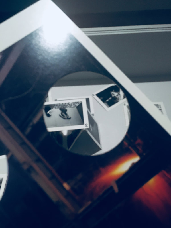
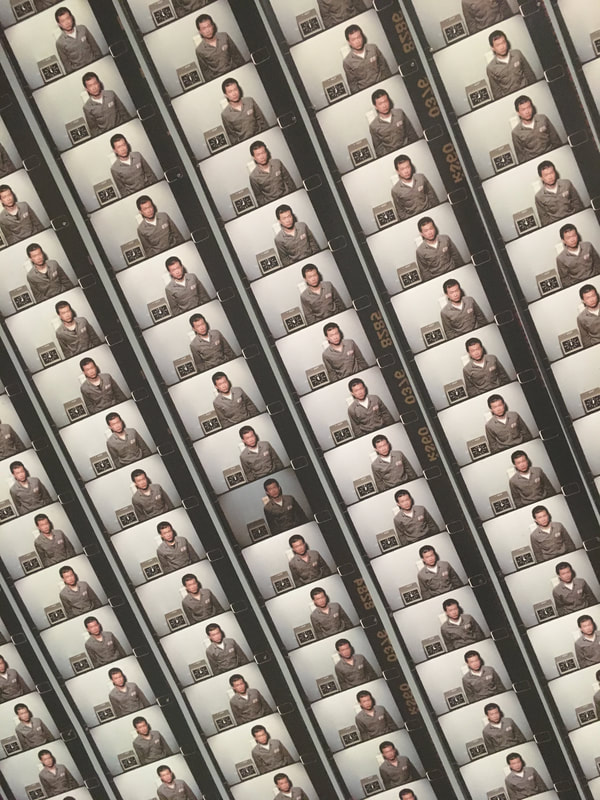
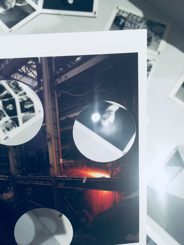
For this assessment we had to pick out five pictures from a large collection. I chose a theme of disturbed photos. I like the theme because they all have an aesthetic vibe, some more than others.
|
|
|
|
|

|
|
|
|
|
|
|
|
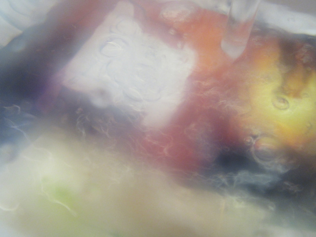
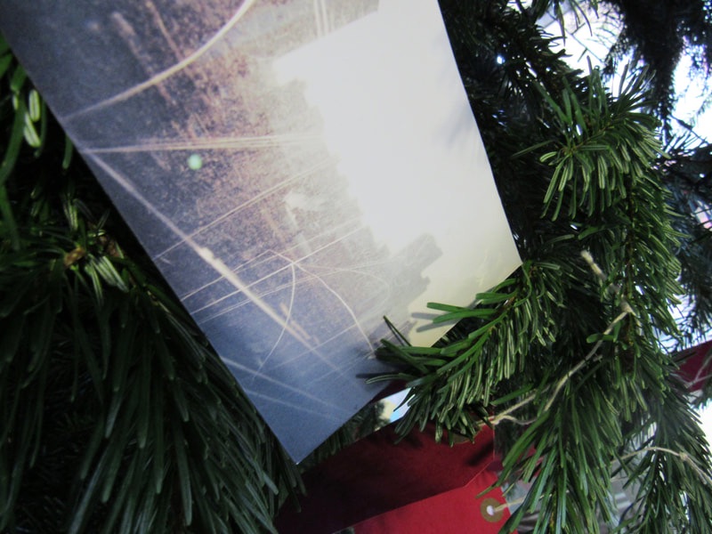
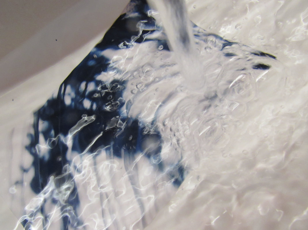
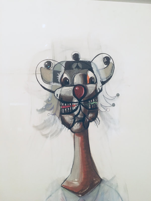
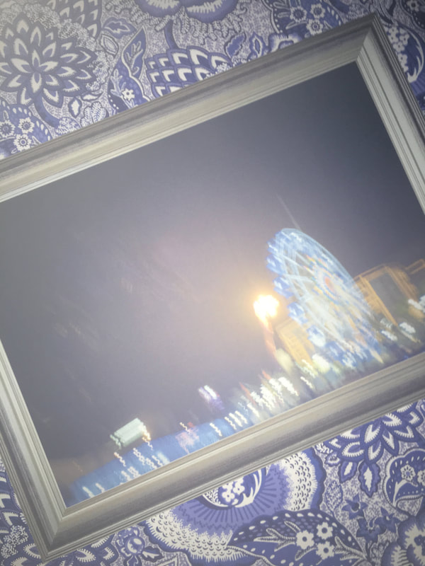
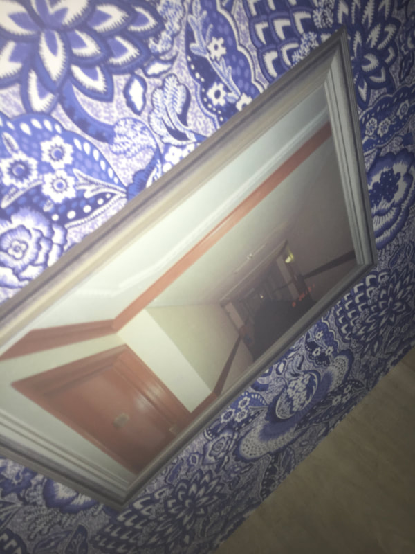
This picture is my favourite because it is very mysterious but it also has an aesthetic vibe to it.
|
|
|
|
Photograph Comparison
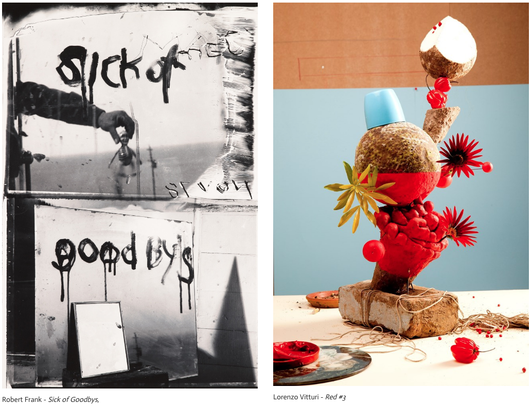
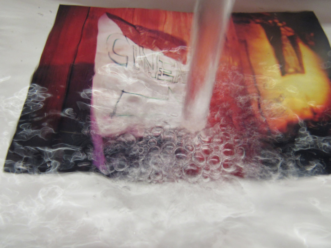
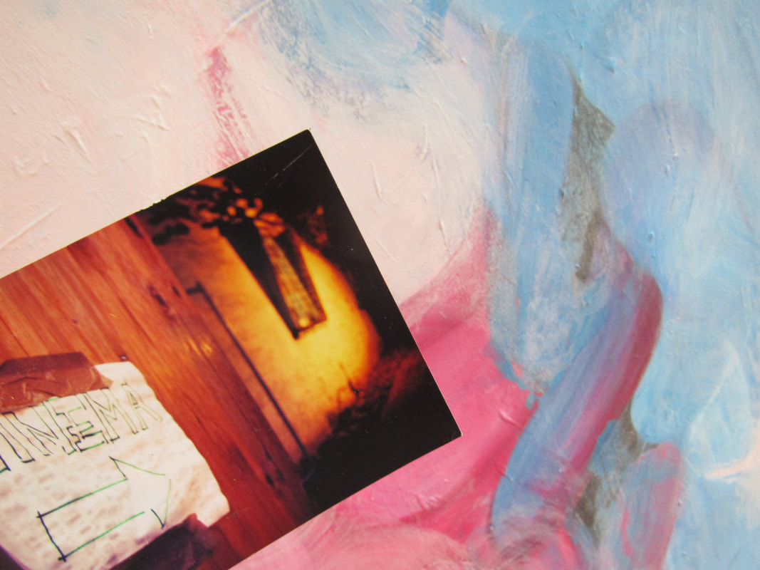
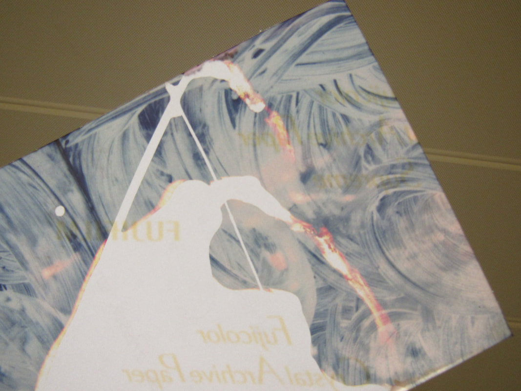
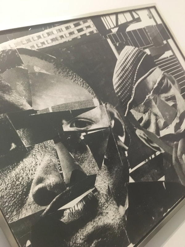
In the first image I can see that it is a photo of mirrors with the words 'sick of goodbys' written on it in a liquid, but it is hard to know what the liquid is because the photograph is in black and white. In the second image I can see it is a photo of a brick with a bunch of flower type objects on top, this image has very saturated, vivid colours like red, blue, brown, green and white. Both of these images are portrait but the ' sick of goodbys' image is divided into two sections.
One of the main similarities in the images is that they are both messy/complex photos meaning the images do not have a pattern but they are just scattered. One of the differences is that image 1 is reflected light because of the mirrors that are in the image, and image 2 has solid light (no reflections). In Franks photo (image 1) the foreground is the mirror and the text saying 'sick of goodbys' whilst the background is the reflection of an arm holding a doll. In Vitturis photo called red the foreground is of a messy image of a brick with colourful flower objects and the background is a blue and orange wall.
In Franks photo the edges are mirrors. The top half of the image has one mirror with the words 'sick of'. At the bottom half of the images is an of two mirrors, one of the mirrors has the reflection of the mirror meaning this image has a total of 14 edges.
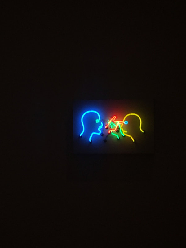
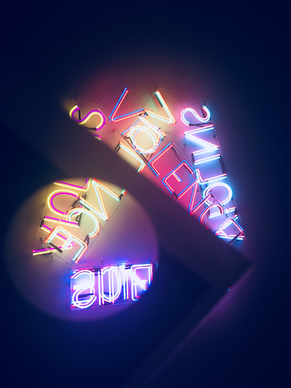
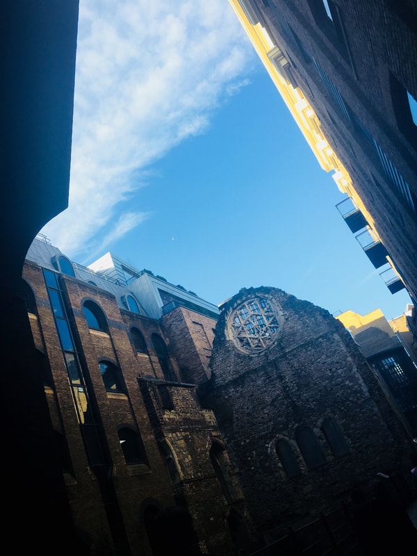
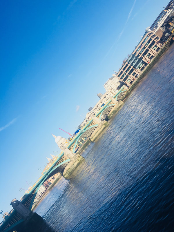
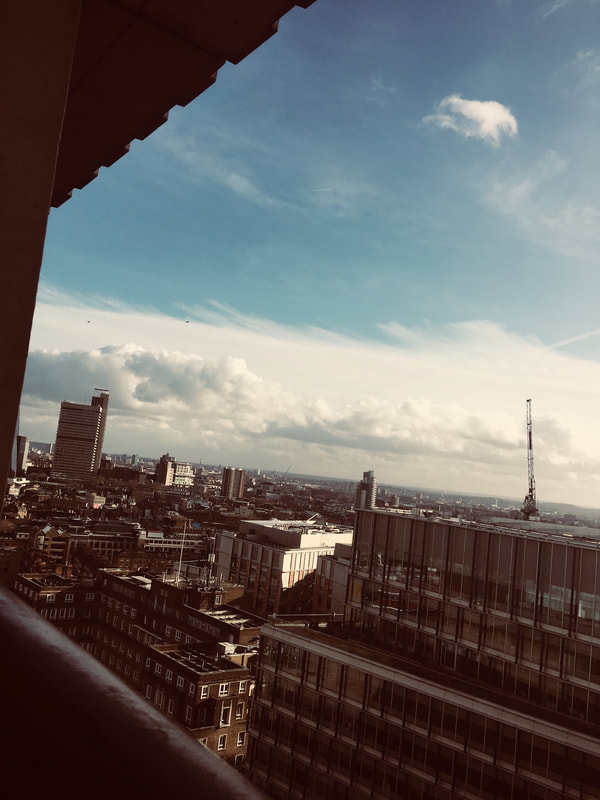
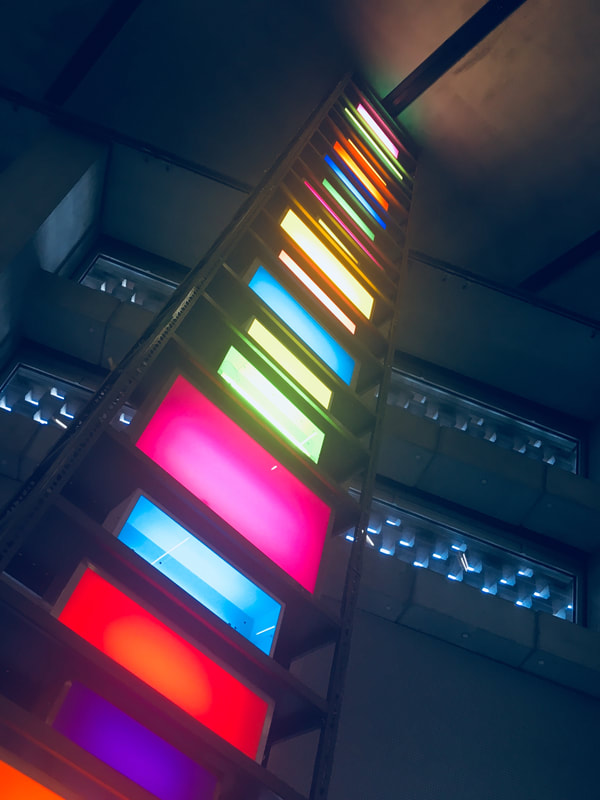
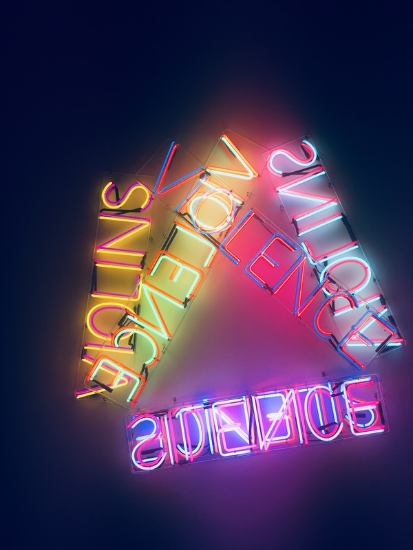
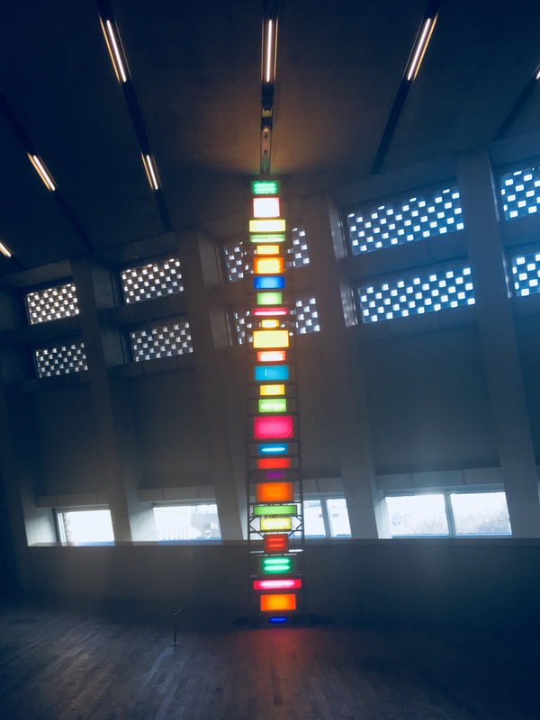
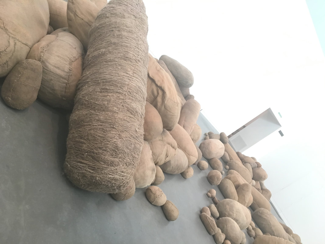
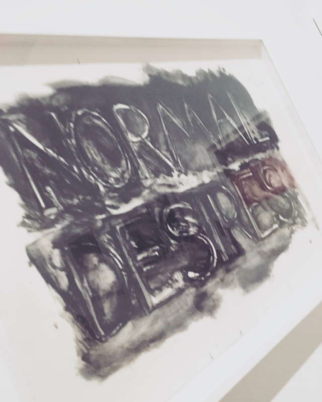
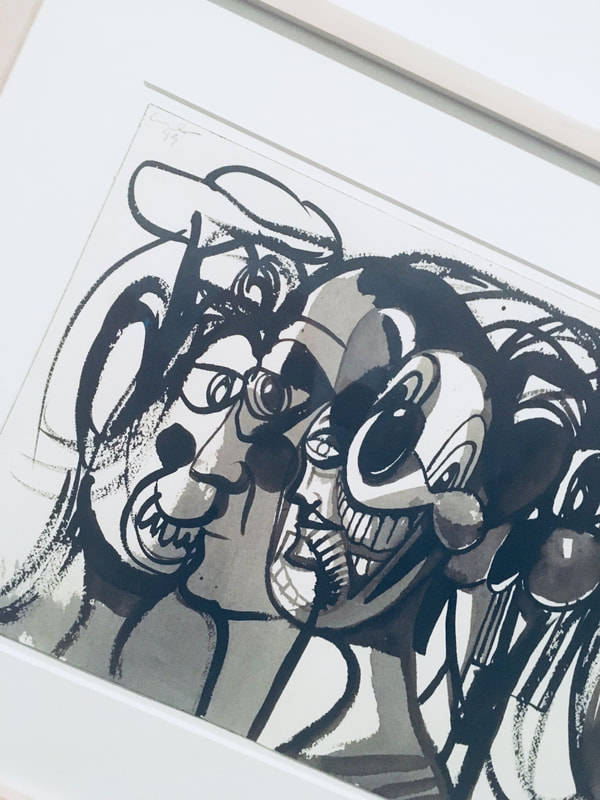
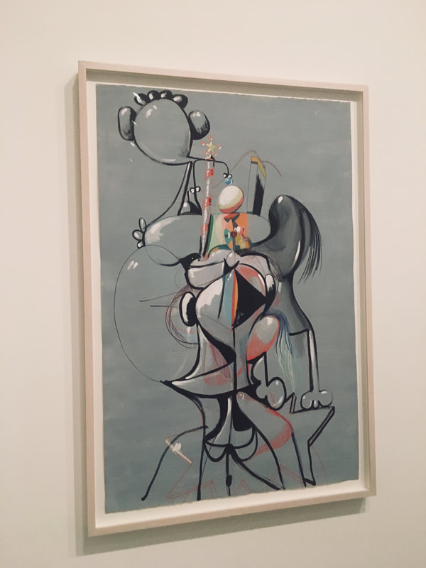
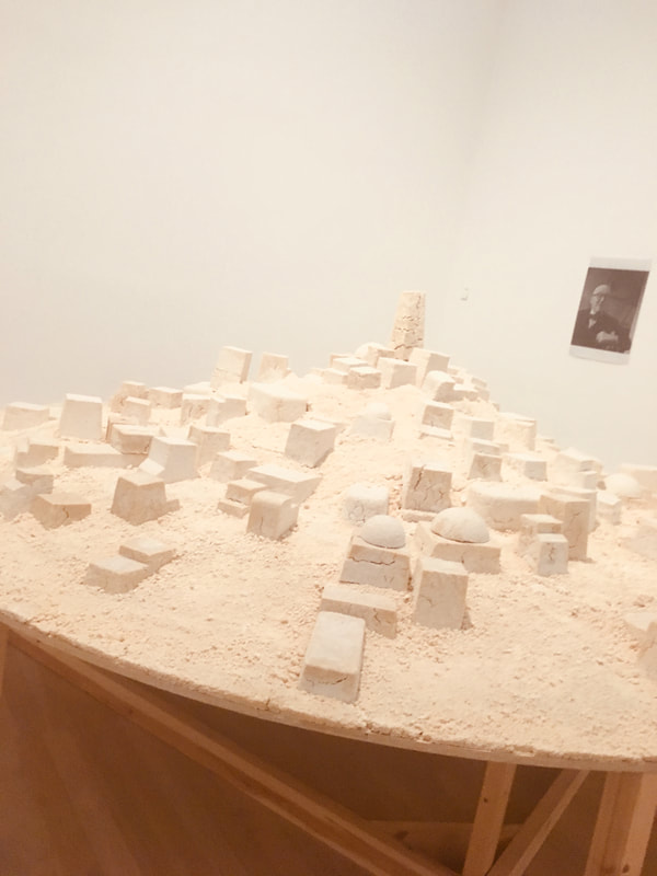
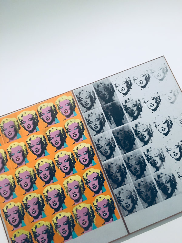
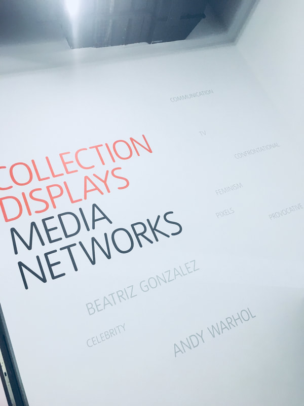
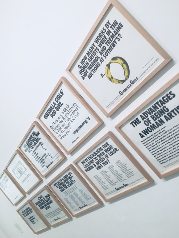
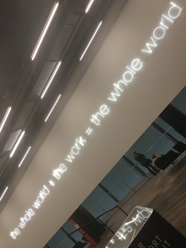
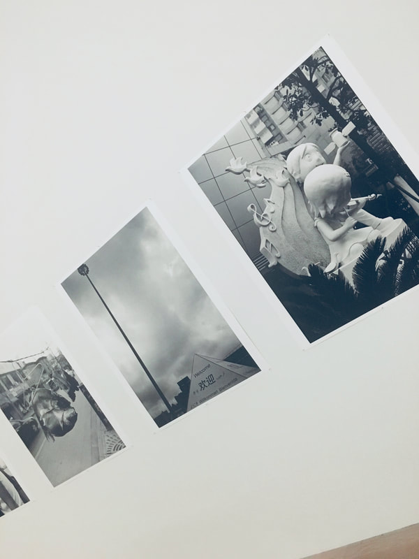
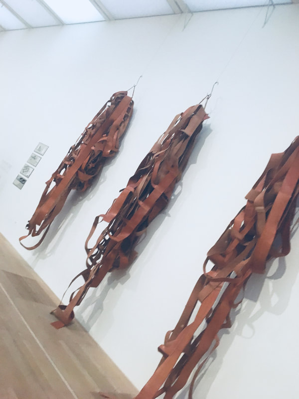
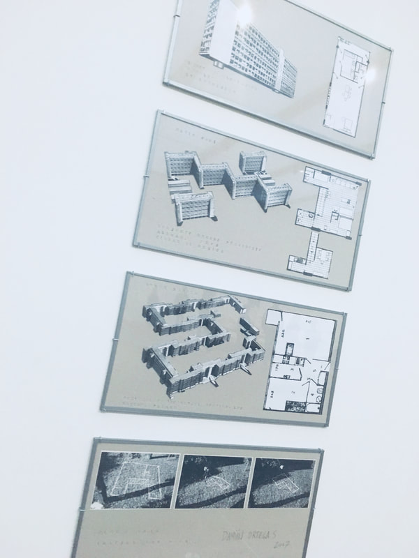
Tate Modern
|
|

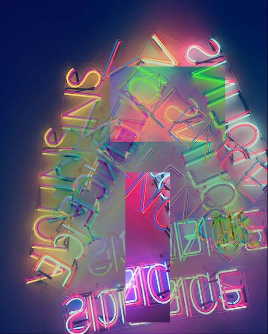
For this image, I used photoshop. This is all the same picture, I just cropped some areas and relocated them around the photo.